Tuesday, November 24, 2009

Janusz Kaminski is one of the the masters of light and shadow in today's film world

At times, in his directorial debut Lost Souls for instance, he can use heavy shadows and limited background to give a feeling of isolation as the main character feels more and more alone as he realizes there is little he can do to stop himself from becoming the antichrist (style over story here).
The shadows in the movie don't just give the film a horror feel or a dark atmosphere, it becomes a looming ominous being that is the character's unavoidable fate.
In Judd Apatow's Funny People, Kaminski finds himself at the opsite end of the spectrum. Not only is the movie supposed to have a mello tone in the midst of a very heavy situation, but again the very bright light and color of the film is a representation of the main character heading towards the light. Some scenes in the film are so bright, for instance when George is told he has cancer, that light coming through a window facing the actor washes out part of the doctor's face who is sitting opposite from him.

The light is always on George, also showing that he is always in the spotlight, that he cannot escape his fame.


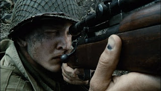
This seems like kind of a one trick pony right now, too bright, too dark, but then there is a middle ground, Kaminski at his finest, in Spielberg's Saving Private Ryan. Here light and shadow come and go more naturally, giving the film a very authentic and real feeling. The shadows highlight sometimes fall just across the eyes of the actors dressed as soldiers, making them look completely uniformed and showing the solidarity of the group.
http://www.apple.com/trailers/universal/funnypeople/


Light floods a scene in an army staff office as women type letters to families about how their sons and husbands have passed on. Not only is Kamiski highlighting the feeling from Funny People, the heading to the light at the end of the tunnel, but it gives a feeling of surrealism as a woman realizes that 3 brothers from the same family have just passed. Later, a scene in a church is covered in shadows as soldiers talk by candle light. At times there are even features of the scene that the audience cannot see, again, Kaminski is trying to provide a feeling of the audience actually being there at that moment. He sacrifices the movie magic conventions to provide a real experience. Contrast in the film makes colors slightly more dull, Speilberg and Kaminski's idea of how to make the film look like the time period without sacrificing style.


Tuesday, November 10, 2009

Friday, September 18, 2009


The lighting in Edwards Scissorhands shows two worlds that are clashing constantly, the normal and the abnormal, reality and fantasy, exterior vs interior beauty. This heightens the modern fairy tale feel of the movie, this small colorful normal town that just happens to have a dimly lit abandoned mansion in the edge of town.


To go along with the modern fairy tale feel, the lighting mimics scenes from movies it is trying to offer the feel of (improperly written sentence), for instance:

here Peg has approached the abandoned mansion at the top of her normal town. Outside it is quite bright but inside


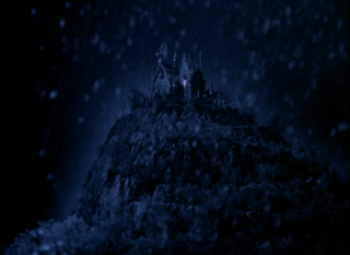
Burton uses sets and lighting that closely resemble that of Dracula. Here we see a darkly lit mansion with just enough light coming in through the windows to cast large shadows and highlight the decrepit nature of the interior, which heavily resembles Jonathan Harker's first entrance to Castle Dracula.
Later Peg finds Edward in the attic hiding in the shadows. The image seems heavily inspired by The Cabinet of Dr. Caligari when his monster first emerges from the shadows, or moreover, the reveal of Frankenstein chained up in the basement. The slow reveal of the creature from the shadows into light heightens he tensions and small amount of terror experienced.


The correlation of these images (Dracula and Frankenstein more than Caligari since it's german, and silent, and most haven't seen it) and the familiar setting and lighting gives this particular film the familiarity of a classic horror film while maintaining the feel of a fairy tale.


Tuesday, September 8, 2009


Scene starts with shot of Frank Nitti on the phone in his office. The most well lit object in the shot is his left hand, accentuating the dark deal he is making with..

a dark figure who we see arriving outside of what appears to be a hotel. Not a full scale establishing shot, it is concise, putting the emphasis on the arrival. Notice that the right side doorman is slightly more lit than the left side doorman, the middle being taken up by...

Tom Hanks, as Michael. Here the camera meets Michael in the lobby, eye level, and travels with him through the shot


as he walks to the elevators. Once he turns the corner we go over the shoulder to see the rest of the lobby. The camera stops at the elevators letting Michael get on and turn to the camera, methodical stare as he travels down his own road to perdition, ah ha.


The camera starts out with an overhead and immediately you see how much light the hallway is bathed in as Michael steps out of the elevator, into the light ad possibly towards redemption.


The overhead shot becomes a tall tracking shot that slowly comes back down to his eye level. This is important because despite the fact that Michael went up on the elevator from ground level, we are still looking down on him. The camera comes down because this is Michael's descent into damnation at this point in the film.


In the final few steps before Michael turns the corner, his eyes and most of his figure go black, as our character descends into darkness. 
Inside the room the camera stays close to Michael as he scans the room, and we scan with him, until, alas, he finds what he was looking for


and the camera starts to slow dow down and hold back as Michael enters the bathroom.


After the deed is done, Michael walks out of the All White bathroom, his arm slightly catching the bathroom door knob, finally revealing to us what has happened, Michael has shot his step-brother in an attempt to avenge his family.
It is important that only Michael goes into the bathroom and not the camera. It is his journey into darkness, his burden to kill his step-brother, and we must let him go in alone. Also, it looks really cool this way.

As Michael walks out, his back is covered in darkness while he faces and walks towards the light. However he is never fully lit as he leaves the hotel, and the shot ends before he reaches the end of the hallway where he would be bathed in light. By killing his step-brother he damns himself.

This was Conrad Hall's last movie and it was dedicated to him, so subsequently, this shot by shot analysis is also dedicated to the man who framed Cool Hand Luke.

Thursday, August 20, 2009

lgst2795johnny-depp-is-edward-scissor-hands-edward-scissor-hands-poster.jpg

600full-edward-scissorhands-poster.jpg

As a child, Edward Scissorhands was like the most high concept movie I'd ever seen, as like and 8 year old child. It was so odd, and the shots of Edward always hold this like Magical Awkwardness to them while also holding this German Expressionism style that I'd later recognize. It's so fascinating and increases my enjoyment of the movie to see these shots that are similar to The Cabinet of Dr. Caligari and Nosferatu for this lovable fairy tale character. Burton is definitely one of my favorites just because he is one of the most easily identified styles today by how unique the art direction of the film is. I know a Burton movie when I see one because he really puts himself into the aesthetic of each film.

2564.jpg

Roger Deakins is a badass, fact not opinion. Shawshank is, in my opinon, the best movie ever made (eat it Welles) and I could have picked any shot from this movie, except the ones where the url access was forbidden, and it would look great. The movie shows so much commentary on the human soul through its dialogue but also through its lighting techniques, and it's hard for me not to get goosebumps from some of the sequences.

The-Assassination-of-Jesse-James.jpg

no_country_for_old_men.jpg

This is just more of Deakins being a bad bad man. Specifically with Jesse James and No Country you get so much perspective on the scope of the landscape in relation to themes in the movie, especially with the isolation in No Country for Llewelyn. Deakins images are like movie poetry, they are very complex but pleasing.

ryan.jpg

n27984.jpg

Janusz Kaminski is also a badass. Much like with Shawshank, you could take pretty much any piece of film from this movie and it would be inspiring and beautiful, and honest. Kaminski emphasizes light and shadow play a lot in his films, and as a viewer its pleasing because it gives more meaning and soul to the film.  With Funny People Kamnski is almost too obvious wth his lighting choices because the movie is about life and dath, but there are shots like these with this well lit household in a scene where secrets are born, so there is the irony in it that. Totally underrated film by the way.

0c49929f113aac9b_funny-people.jpg

If Deakins and Kaminski got into a DP-off, who would win? All of us.

large_wall-e.jpg

2008-07-04-image3WALLE.jpg

WALL-E was pretty awe inspiring the first time I saw it, and the second, and so on. It seems so accessible as a kids movie, but when you see the constuct of some of the shots, its an amazing film without the modifier of a "kids" movie. The way they craft certain shots makes you feel it was actually being filmed rather than created on a computer. Any PIXAR film could have been in this place, but specifically WALL-E was impressive with what you could do with the medium if you wanted to, and I'm very happy they made this film. The opening to it is particularly good because of how well the images of space, and the trash blend with the music.